2009年3月31日 星期二

Spring 2002 RTW


Spring is all about color.
Designers are staging a backlash against fall's somber mood,
and Jacobs is spearheading it. This season is apparently different from his previous collections.
He used more hues to present the mood of the collection. The colors are nature and warm. All of them are floral color.


Colors


Black & white, Forest green, Orchild,
Sky blue, Purple, Orange, Brown


Color wheel


Wheel color scheme
are used. Purple, blue, orange , yellow, red and green hue are included in the colors.


Outfit : Analogous color scheme
These are related colors from a pie shaped slice of the color wheel. Purple, salmon and blue are in the hamony by using same chroma.

His style of the design is flat and the silhouette is just the sahpe of body.

2009年3月27日 星期五

Fall 2001 RTW

Gone were all of Spring's campy, sugar-coated references to the clubby '80s. Fashion's recurring ladylike motifs with playful details and an unforced spirit of innocence. The style seems familiar. MJ's collections always let us feel comfort to wear in vision. All the designs are not exaggerated but have many details that are attractive. All the colors are in hamony.


Color wheel
Colors : Lavenderblush, Gray, Black, Light steel blue, Ghost white

Color Scheme : Complementary Color scheme

The main hues are blue and pink. The variations of the colors are on the degree of chorma and value.


The outfits always use monochromatic color
scheme.


You can see that he utilize color to create illusion on the collar. In vision, there is a collar but the collar is only created by few black/white lines.

2009年3月25日 星期三

Fall 2000 RTW


This collection reveals the classic design of 70's. Simple designs never get out-dated. These colors absolutely are my choice. The colors choosen are classic. The mood is neutral , classic and warm. Low chroma was still put into effect.


Color

Oliver Green, Maroon, Dark purple, Dark slate blue


Color wheel


Mainly 3 hues were used with similar saturation. This kind of color scheme is called Angled Accents.


Analogous color scheme is used in the outfits to match the clothes


Spring 2001 RTW

Spring 2001 RTW


S2001RTW is inspired by 80's and the pastel shell-shaped. This collection is much more vivid and sweetie than the previous one. Some designs are neutrality. The menwears use some warm colors. The whole collection let the model look like common touch and nice.


Color Family

Red, Tomato, Salmon, Mediumpurple, Green,
Brown, Medium sea green

The collection apparently has many hues. The proportion of the warm and cool color used is quite even. The expression from the colors is rich. The mood includes fleshness, sweetie, softness, clean and optimistic. The color make me feel amaze.


Color wheel


The disturbution of the colors is so wide. The chroma is adjacent.
It uses the tetrads color scheme. More than 3 hues are used (Tomato, Mediumpurple, Green,
Medium sea green).


This outfit uses complementary color scheme!!!
It' s really sharp and attracts my attention.
The colors used are totally different from S2000 RTW.


<---mainly Monochromatic color scheme but actually is Complementary color

A small part of tomato, shell-shaped printing make the outfit more vivid.

2009年3月24日 星期二

Spring 2000 RTW

Spring 2000 RTW
The mood of the clothes was evocative of a California surfer girl on holiday in a Parisian discotheque circa 1979. The overall is so soft , relax, and mature.
Each outfits normally use monochromatic color scheme to match the clothing. Monochromatic color is really easy to match.

Color Family


Colors:
Medium purple, Shadow, Sepia,
Lavenderblush, Elephant, Dark brown, Oliver


These colors mean peaceful, earth, soft, warm, fashion, netrual and classic.
They match with the design of the collection.


Color wheel


The diagram shows that the colors of S2000 RTW disturbute mainly along three hues.
3 adjacent colors are used and the colors change slightly on the chroma.
It is using Analogic color scheme.The colors belong to warm color.They make our visions feel soft and warm.


The colors is mature and only change slightly on chroma.
I love this tone. It make me feel relax.


I love this outfit the most.
The seam line is using a lighter color fabric to sew.
It is quite cute.

MJ love obama


photos from MJ shop

T-shirt by MJ

Marc Jacobs makes a subtle political move with this new special edition t-shirt available exclusively at Marc by Marc Jacobs Stores for 18$. I hope at least some of the funds from the shirt will go to help a special someone’s campaign.

It seems that "obama effect" is so great. Fashion is a good vehicle to facilite the influence of the message.

2009年3月22日 星期日

Color chance


Punk and hiphop style guys like to wear high chroma color clothing~
These colors really sharp and stimulate our vision.
It is easy to observe theim in the crowd.
They like to catch the public notice and individualistic.
Color can be a visual tool that can help us to find friends without verbal communication.

2009年3月21日 星期六

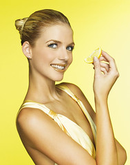
Complexion


Here is the complexion


For white complexion

suitable colors:

Light color (Light yellow, light blue, light pink, light green) --à look more sweetie.

Dark color ( Dark blue & grey, red)


avoidable colors:

Cool color


For yellow complexion

suitable colors:

Warm color - Pink, orange

avoidable colors:

Grayish color, green


For black complexion

suitable color : warm color and low saturated color,black, white, grey, mainly brown


choose the right color can tone our complexion and let us be more charming~!!!!


ME~~~~~~~~~~~~~~~~~~~~~~~~~~~~~~~~~~~~~~~~~~~~~~~~~~~~~~~
ivory / golden bedgie complexion
a wrong example!!!!!hahaha

I should be wear some warm color. Grey color make me look dull.

2009年3月20日 星期五

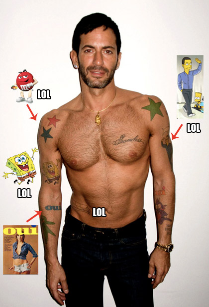
MJ love cartoon

I <3 them all actually. French porn mag = "Oui Oui" (yes please)
FYI: He's mad gay for that tattoo.

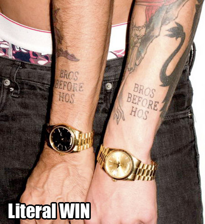
MJ apparently loves cartoons and tattoos!!!!!!SpongeBob , M&M tattoo~~a lil bit ridiculous but cool~
It will be more fabulous if he can have a hello kitty tattoo~haha
These habits influence his color preference ~
----------------------------------------------------------------------------------------

Marc Jacobs: Why I love SpongeBob SquarePants!

~
SpongeBob SquarePants is officially the hippest cartoon character on the planet - or should we say, on the sea bed, where he lives in an underwater pineapple. Scarlett Johansson and Justin Timberlake are confirmed fans of the talking sea sponge. Liam Gallagher has just taken delivery of a Warhol inspired SpongeBob portrait. The latest high profile fan is uber-designer Marc Jacobs who has a tattoo of SpongeBob on his bicep. So, we just had to ask Jacobs , what's so great about Spongebob? ‘I started to watch SpongeBob because of a painting by Richard Prince,' says Marc. ‘He did a show at Barbara Gladstone Gallery in NY a couple of years back. He had cheque paintings - US bank cheques mounted on a canvas with jokes painted on them. One of the backgrounds of the cheques has SpongeBob on them - being such a huge Prince fan I checked into the SpongeBob thing and started watching it. It's amazing - the characters, the colours. It's surreal. I looked into it and saw it really has a huge influence. I mean I don't know if Rei Kawakubo (of Comme des Garcons) ever watched SpongeBob. I started to look at Comme des Garcons and thought her colour sense was very SpongeBob. Then I started looking at characters in fashion shoots, and I thought there is whole SpongeBob thing that has infiltrated and influenced the way people think whether they know it or not. So I just kinda became fascinated by the kind of art of SpongeBob, yeah. I don't even listen to it. I just like having it on screen with the sound down. Watching the colours change. Then, you know, I did a Vuitton show and we had a video case loaded up with moving images from SpongeBob - and I came down runway at the end carrying it. As a kind of homage to Richard Prince, and to show where the colour palette came from.' We wonder if SpongeBob realises he's so hot right now?!


2009年3月14日 星期六

Basic knowledge of color

Additive color
subtractive color wheel


Hue - spectral color name
Value - lightness or darkness
Saturation - brightness or dullness


Achromatic: Black, white and the grays

Chromatic grays : This just means dull colors, or a hint of brightness. Colors near the center of the color wheel are neutral.

Monochromatic: one dominant hue


Analogous: These are related colors from a pie shaped slice of the color wheel.

Complementary: This scheme uses colors that are opposite on the color wheel


Triadic: Usually red, yellow and blue


Sources :
http://daphne.palomar.edu/